ggplot(data= my_data, aes(x = (optional categorical variable),  y = var1)) +
geom_boxplot()Data Visualization
Sections 2.7 - 2.9
5NG#4: Boxplots
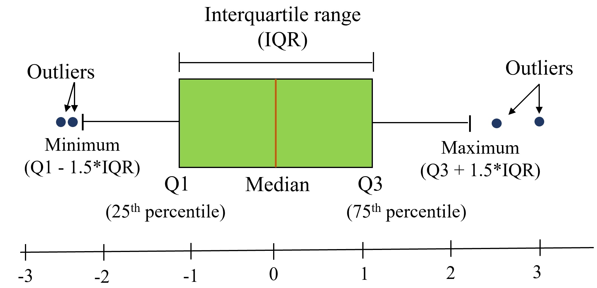
There are 3 things that we typically focus on and describe/compare when inspecting a boxplot:
- center
- spread
- shape and outliers
Example 1: Barplots
![]()
Consider the Palmer Penguins dataset.
library(palmerpenguins)
head(penguins)
# A tibble: 6 × 8
species island bill_length_mm bill_depth_mm flipper_length_mm body_mass_g
<fct> <fct> <dbl> <dbl> <int> <int>
1 Adelie Torgersen 39.1 18.7 181 3750
2 Adelie Torgersen 39.5 17.4 186 3800
3 Adelie Torgersen 40.3 18 195 3250
4 Adelie Torgersen NA NA NA NA
5 Adelie Torgersen 36.7 19.3 193 3450
6 Adelie Torgersen 39.3 20.6 190 3650
# ℹ 2 more variables: sex <fct>, year <int>We are interested in plotting the distribution of species.
Are we using geom_bar() or geom_col()?
Example 2: Barplots
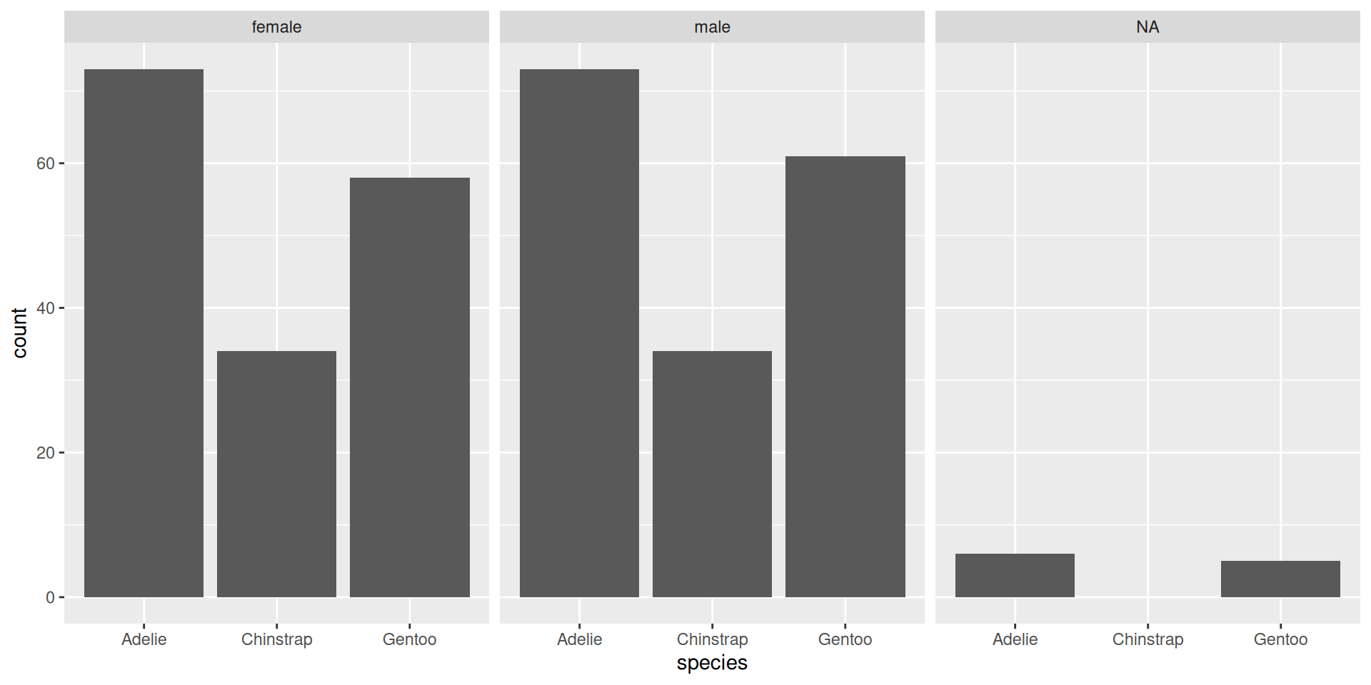
What if we want to visualize the distribution of sex in each of the species. There are 4 main ways to visualize multiple levels within a categorical data:
ggplot(data=penguins, aes(x = species, fill = sex)) +
  geom_bar()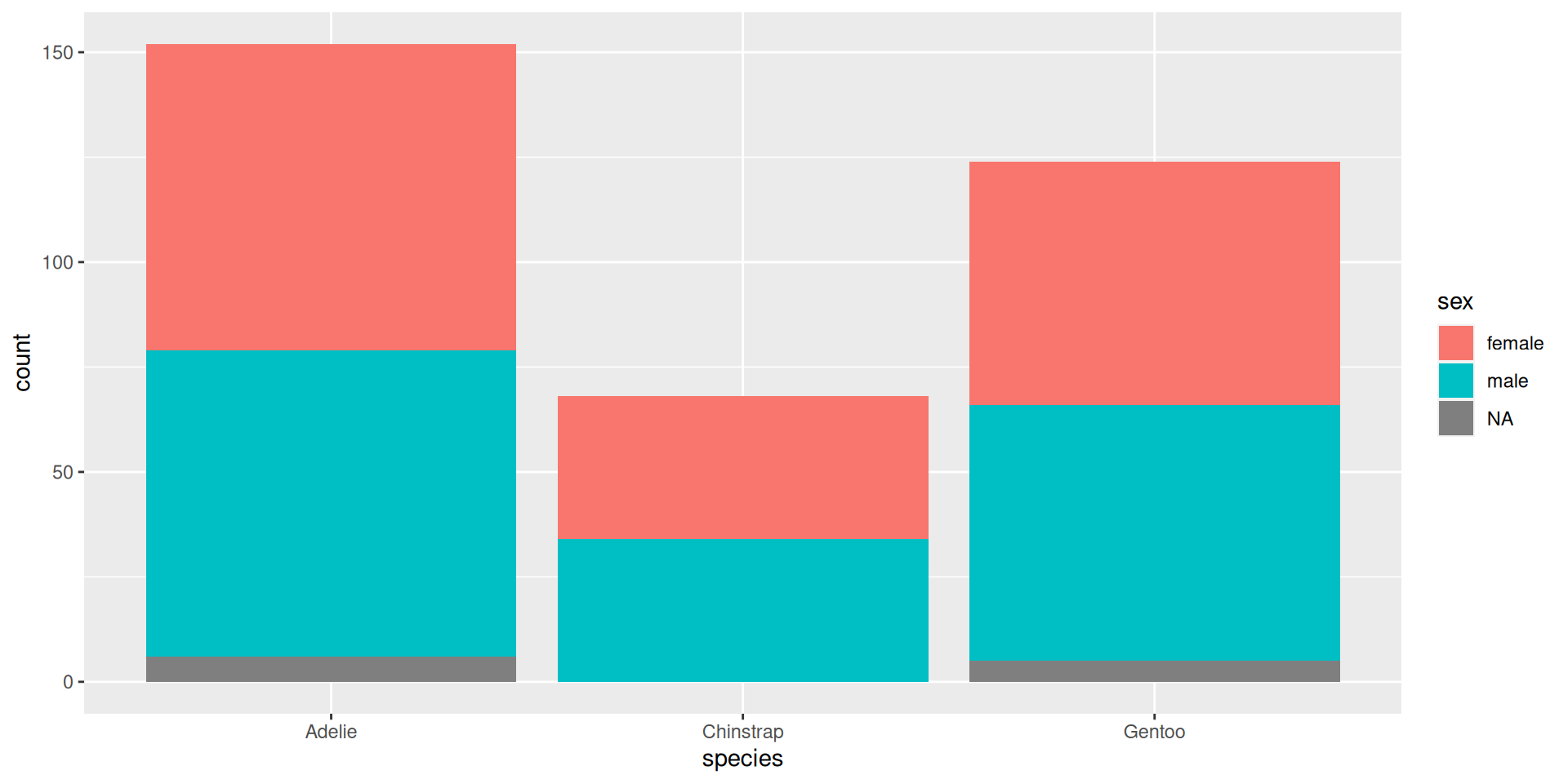
ggplot(data=penguins, aes(x = species, fill = sex)) +
  geom_bar(position = "fill") +
  ylab("proportion")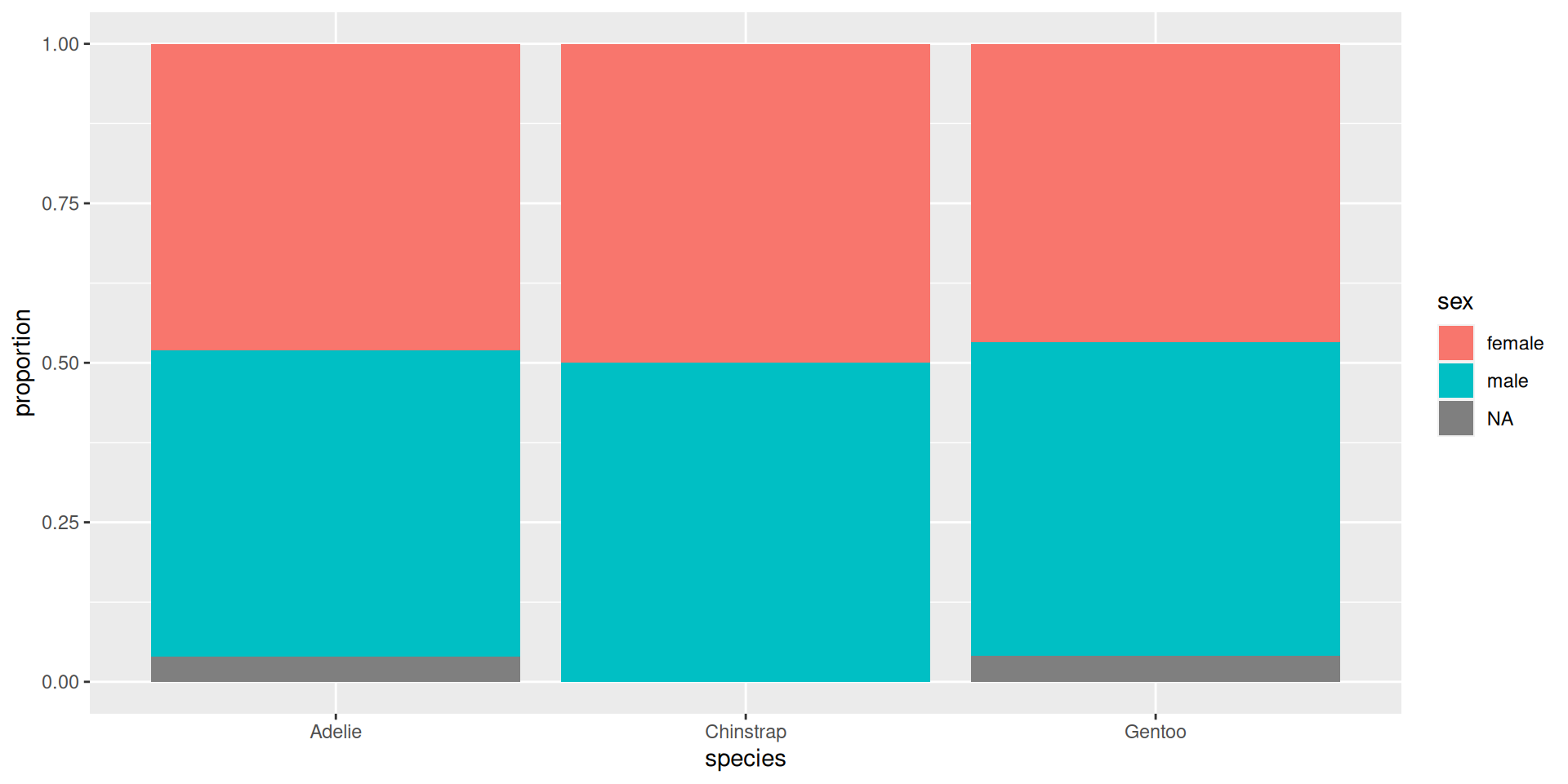
ggplot(data=penguins, aes(x = species, fill = sex)) +
  geom_bar(position = "dodge")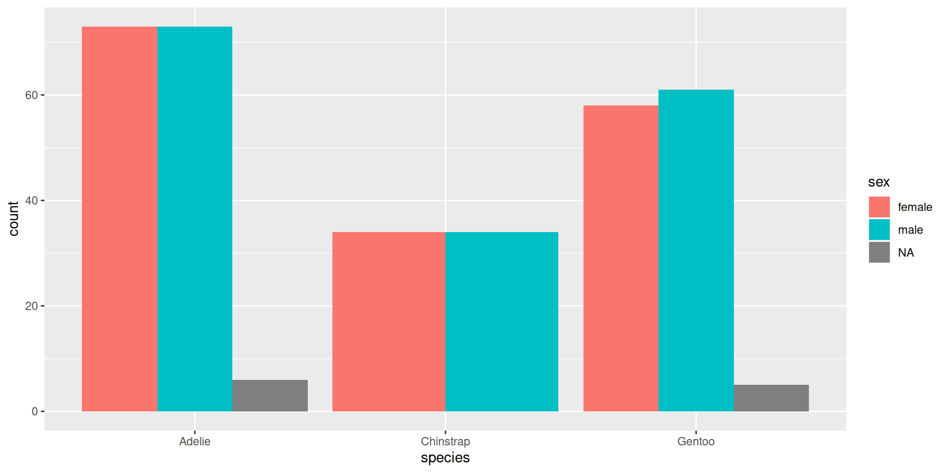
ggplot(data=penguins, aes(x = species))+
  geom_bar() +
  facet_wrap(~ sex)